Tuesday, August 23, 2011
Wednesday, August 10, 2011
You Are What You Eat
Today is a two-post day because the moment I watched this video, I knew I had to share. Fascinating and yet scary. Please share.
GMO Film Project Sizzler from Compeller Pictures on Vimeo.
Up - Gray'd
The living room is now a subtle tone of gray and I have to say we are very pleased with the results. We're still piecing it back together and I am still deciding if now is a good time for some re-arranging of things, but the general consensus is: its a win!
Now, can we please get back to obsessing over black walls? In the past few days I have found several amazing images of black rooms and I think I have all but decided the dining room is next. Yep, that's right dining room --- we're coming for you!
Those windows above are to. die.
This next kitchen very, very loosely reminds me of ours. Except for the black paint and sort of everything else...
And then this next pic - which kind of looks like it would be a disaster, but also kind of looks like the best. game. night. ever.
Hello Pictionary?! Yeah, I'm talking to you.
Nice Foo/Fu Dog lamps too btw.
We did actually do a smaller scale version of the chalkboard wall in our kitchen, which turned out pretty cool. We had this random door to nowhere that screamed "SAVE ME!" and so the conversion began. It was kind of a mess to get going, mainly due to the over-spray from the can of spray chalk board paint, but it dried quickly and was ready for chalkin' in no time.
You can kind of see it here.
Oh and while we're talking about things that happened months/years ago.... the Foo/Fu Dogs? I picked up a random set of them at an antique mall last year because they reminded me of a pair of earrings my grandma Mimi used to have. She had lots of crazy earrings, which might explain why I have lots of crazy earrings, but aside from that --- I thought they were cool and I liked their symbolism of them as it related to ancient Buddhist tradition.
You can sorta-kinda-barely see them in this pic:
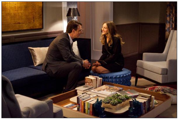
Any way, the very next week I was sitting in the movie theater with my girlfriends for Sex In The City II, when I saw the same dogs in turquoise on Carrie Bradshaw's coffee table....
And as it turns out --- basically we're twins, which I sort of always knew, but now have confirmation of.
After searching for this image today (thanks HomeBunch) I also noticed the sort-of-gray color on the walls and realized how much I need a turquoise ottoman.
And while we're on the subject of that apartment, you may as well check out the entire tour of their super posh "home" that I found today here.
I read through it and couldn't believe the price on some of those items. Nuts. Anyway, lots of great images to inspire me today. Just wanted to share.
Now, can we please get back to obsessing over black walls? In the past few days I have found several amazing images of black rooms and I think I have all but decided the dining room is next. Yep, that's right dining room --- we're coming for you!
Those windows above are to. die.
This next kitchen very, very loosely reminds me of ours. Except for the black paint and sort of everything else...
And then this next pic - which kind of looks like it would be a disaster, but also kind of looks like the best. game. night. ever.
Hello Pictionary?! Yeah, I'm talking to you.
Nice Foo/Fu Dog lamps too btw.
We did actually do a smaller scale version of the chalkboard wall in our kitchen, which turned out pretty cool. We had this random door to nowhere that screamed "SAVE ME!" and so the conversion began. It was kind of a mess to get going, mainly due to the over-spray from the can of spray chalk board paint, but it dried quickly and was ready for chalkin' in no time.
You can kind of see it here.
Oh and while we're talking about things that happened months/years ago.... the Foo/Fu Dogs? I picked up a random set of them at an antique mall last year because they reminded me of a pair of earrings my grandma Mimi used to have. She had lots of crazy earrings, which might explain why I have lots of crazy earrings, but aside from that --- I thought they were cool and I liked their symbolism of them as it related to ancient Buddhist tradition.
You can sorta-kinda-barely see them in this pic:
Any way, the very next week I was sitting in the movie theater with my girlfriends for Sex In The City II, when I saw the same dogs in turquoise on Carrie Bradshaw's coffee table....
And as it turns out --- basically we're twins, which I sort of always knew, but now have confirmation of.
After searching for this image today (thanks HomeBunch) I also noticed the sort-of-gray color on the walls and realized how much I need a turquoise ottoman.
And while we're on the subject of that apartment, you may as well check out the entire tour of their super posh "home" that I found today here.
I read through it and couldn't believe the price on some of those items. Nuts. Anyway, lots of great images to inspire me today. Just wanted to share.
Monday, August 8, 2011
Can of Worms
Requisite Gray is on the walls. It looks fab.
The fireplace, still covered in paper.
Today I saw this:
And I love it.
The fireplace, still covered in paper.
Today I saw this:
And I love it.
Thursday, August 4, 2011
To Paint Or Not To Paint
When we last left you we had just put a new paint color on our living room walls. That project is still in progress, but we've already moved on to other ideas. The funniest thing about all this paint madness is that yesterday marked our 1 month wedding anniversary. Why is that funny you ask? Well, while we were chillin' (sweating) on the beach in Curacao on our honeymoon, we talked about how we were taking a break from house projects for at least 3 months. You know, take some time to relax after all our hard work planning our primarily DIY wedding and lots of home projecting for guests. We do, after all, still have about 15 projects to update you on both wedding and house-related. So, taking a few months to regroup seemed like a good plan.
Well, you see how long that lasted. :)
Back to the walls. The plan is to cover the entire room in Sherwin-Williams "Requisite Gray" (which we will be color matching at HomeDepot for a more affordable option). This color passed the daytime into nighttime test on all four walls unlike some previous contenders. It still looked gray everywhere...not even a hint of purple. Phew! But then during testing we got the crazy idea to take our painting a little bit further....and we did this....
Cue dramatic music! Bum! Bum! Bum!
And now for the buzzkill...
That's actually just paper from our Stendig Calendar that we taped to the fireplace as a way to test the concept. It still really looks like this:
But we're torn. Should we take the plunge? The white definitely looks more modern, but we love a good brick accent. The wall we knocked out in our kitchen for our beer tap is one of our favorite projects in the house:
But something about the fireplace brick just doesn't look as cool. The good news is the white calendar paper is pretty convincing and so we feel like we already know exactly how it will look. Plus, we took the liberty of asking our pretend friends John & Sherry Petersik of Young House Love what they think and Sherry says:
We're not ones to argue with two people who have made blogging about their decorating sense a full time job. And clearly we are also not above a little shameless self-promotion over the fact that they answered our email (!!!), so basically - its all but a done deal. But we're still open to opinions.
Do you have one?
Well, you see how long that lasted. :)
Back to the walls. The plan is to cover the entire room in Sherwin-Williams "Requisite Gray" (which we will be color matching at HomeDepot for a more affordable option). This color passed the daytime into nighttime test on all four walls unlike some previous contenders. It still looked gray everywhere...not even a hint of purple. Phew! But then during testing we got the crazy idea to take our painting a little bit further....and we did this....
And now for the buzzkill...
That's actually just paper from our Stendig Calendar that we taped to the fireplace as a way to test the concept. It still really looks like this:
But we're torn. Should we take the plunge? The white definitely looks more modern, but we love a good brick accent. The wall we knocked out in our kitchen for our beer tap is one of our favorite projects in the house:
But something about the fireplace brick just doesn't look as cool. The good news is the white calendar paper is pretty convincing and so we feel like we already know exactly how it will look. Plus, we took the liberty of asking our pretend friends John & Sherry Petersik of Young House Love what they think and Sherry says:
We're not ones to argue with two people who have made blogging about their decorating sense a full time job. And clearly we are also not above a little shameless self-promotion over the fact that they answered our email (!!!), so basically - its all but a done deal. But we're still open to opinions.
Do you have one?
Monday, August 1, 2011
The Porpoise and the Hair
The title of this post is awry. Much like something in this photograph is awry. Can you tell what it is?
Can't find it? What if we take a closer look.....
AW----YEAH!! That's right, your eyes do not deceive you! That my friends, is a paint swatch, or as we like to call it: A wild hair! And its very presence might be a true representation of just how patient and level-headed we really are.
You might recall a day (okay maybe 45 days) when our living room looked a little like this:
And I, at the time, looked like this:
The agony of choosing a universal paint color was entirely too problematic for this girl. You see originally, we had grand plans of each room having its own signature color. We're not talking about a rainbow collection of living spaces, but a few tones that complimented each other and set each room apart.
We loved gray.
Gray was supposed to be the color of choice for the majority of our home, but we could never get it just right. We tried at least 10 different shades and brands of gray, but in the end, it was a warm lavender in some rooms and cold silver in others. With no furniture yet in the house and the old trim still shining through, we really couldn't tell what would compliment each room best and what the color would really look like once everything moved in.
The biggest problem?
We were short on time. Had we had an eternity to think about it, I am sure we could've come up with a color we liked, but as you may recall, our goal was to have the entire house painted prior to moving in. That left us a little over 15 days to come up with a winner. Which might sound like ample time for normal folks. But we ain't normal! With those limitations, we went the safe route, a color we could live with and looked the same in every room:
Sherwin Williams - Kilim Beige.
Now before I go and hurt its feelings, let me just say that Kilim Beige is a delightful color...er....shade. And in the world of beige-s, it is the great equalizer. It's crisp. It's clean. It's beige. We agreed it was the safest and decided to live with it until we had a better idea of what each space wanted. No rush judgments. No crazy colors. No regret.
So very level-headed and so very patient of us indeed.
And now? We're back to gray. A year and a half later we have lived with beige and enjoyed beige and even decided to keep beige in several areas, but at long last the living room is getting a facelift! The swatching has begun and after a single color visited a tiny portion of our walls, we actually think we may have found a winner already! It's either Behr - Dolphin (porpoise - get it?) or Requisite Gray. Believe me - nobody is more shocked to have front runners than us. So in this tale of the Porpoise and the Hair, we are proving once and for all that when choosing paint colors, slow and steady still wins the race!
Can't find it? What if we take a closer look.....
AW----YEAH!! That's right, your eyes do not deceive you! That my friends, is a paint swatch, or as we like to call it: A wild hair! And its very presence might be a true representation of just how patient and level-headed we really are.
You might recall a day (okay maybe 45 days) when our living room looked a little like this:
And I, at the time, looked like this:
The agony of choosing a universal paint color was entirely too problematic for this girl. You see originally, we had grand plans of each room having its own signature color. We're not talking about a rainbow collection of living spaces, but a few tones that complimented each other and set each room apart.
We loved gray.
Gray was supposed to be the color of choice for the majority of our home, but we could never get it just right. We tried at least 10 different shades and brands of gray, but in the end, it was a warm lavender in some rooms and cold silver in others. With no furniture yet in the house and the old trim still shining through, we really couldn't tell what would compliment each room best and what the color would really look like once everything moved in.
The biggest problem?
We were short on time. Had we had an eternity to think about it, I am sure we could've come up with a color we liked, but as you may recall, our goal was to have the entire house painted prior to moving in. That left us a little over 15 days to come up with a winner. Which might sound like ample time for normal folks. But we ain't normal! With those limitations, we went the safe route, a color we could live with and looked the same in every room:
Sherwin Williams - Kilim Beige.
Now before I go and hurt its feelings, let me just say that Kilim Beige is a delightful color...er....shade. And in the world of beige-s, it is the great equalizer. It's crisp. It's clean. It's beige. We agreed it was the safest and decided to live with it until we had a better idea of what each space wanted. No rush judgments. No crazy colors. No regret.
So very level-headed and so very patient of us indeed.
And now? We're back to gray. A year and a half later we have lived with beige and enjoyed beige and even decided to keep beige in several areas, but at long last the living room is getting a facelift! The swatching has begun and after a single color visited a tiny portion of our walls, we actually think we may have found a winner already! It's either Behr - Dolphin (porpoise - get it?) or Requisite Gray. Believe me - nobody is more shocked to have front runners than us. So in this tale of the Porpoise and the Hair, we are proving once and for all that when choosing paint colors, slow and steady still wins the race!
Subscribe to:
Posts (Atom)